Customizing Imbalance 2: The Patterned Plate
Imbalance 2 is a clean, modern, grid-based theme great for blogs, portfolios, and magazine-style sites — and one that easily transforms into a cheerful, mouthwatering food blog. Carrie of The Patterned Plate combined free theme options like a custom header, featured images, and footer widgets with font, color, and CSS upgrades to build a cook’s paradise that would make Martha Stewart drool:
Her site is welcoming but clean, and perfectly showcases her beautifully-styled dishes. Let’s see how she did it.
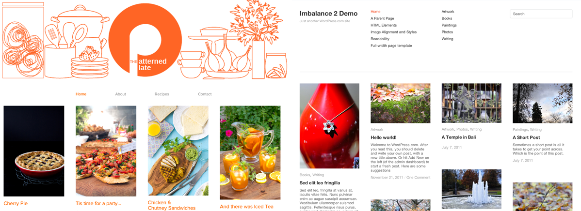
A custom header and footer widgets highlight her branding
Imbalance 2 has space for custom menus or widgets in its header; bloggers can also opt to include a logo image or a completely custom header, as Carrie’s done. A full-width header of whimsical sketches — in a single color, to keep the overall look clean — instantly lets you know you’re in for foodie fun.
Her branding gets a callback in the footer, where image widgets display more sketches along with customized social networking logos in her blog’s signature orange. Centering the largest image widget between text-heavier Links and Categories widgets echoes the grid organization of the theme.

Similarly-sized featured images create a clean grid
Featured images allow you to designate what image appears alongside your post on your blog’s home page — a nifty ability if your posts often include multiple images, as Carrie’s usually do.
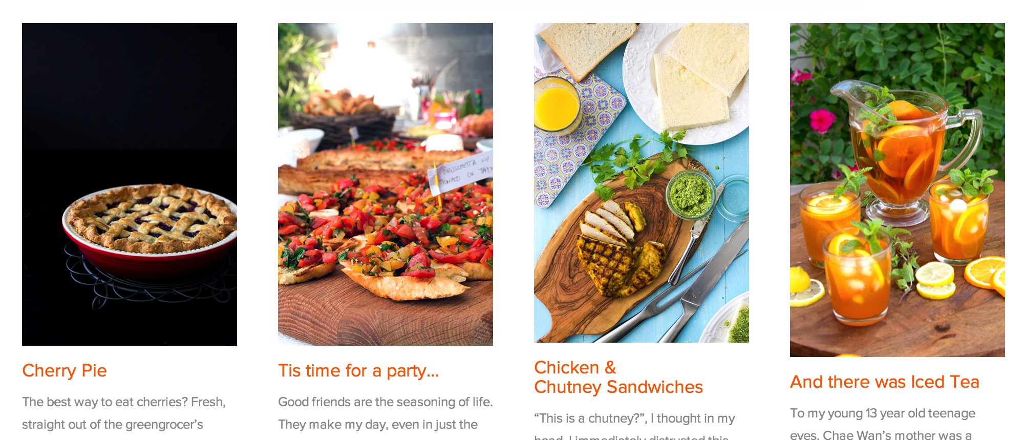
She can choose the most enticing image to draw readers in. By sizing the featured images similarly, she creates a grid layout on her home page. Now, instead of multiple colorful photos competing with one another, they’re neatly aligned in a way that allows each one to shine. (If you’d like to give this a try, you can re-size images from right within the Media Manager before setting them as featured — here’s how.)
Custom fonts and colors contribute to a consistent feel
The color palette is a big part of building The Patterned Plate’s thoughtful, consistent look, so it’s no surprise that Carrie opted for the Custom Design upgrade ($30 per year) to ensure her color scheme carries through every element of the blog. Using the Customizer, she applied the exact shade of orange used in her header and footer to her post and widget titles. Other fonts use basic black or gray, letting the orange (and her stunning photography) pop off the simple white background.
Font-wise, she chose to use Museo Sans, a delightfully open and curvaceous sans-serif font, for all the text on her site — titles, widgets, menus, and body copy. The sans-serif font is clean and unobtrusive, but brings a hint of personality that contributes to The Patterned Plate’s custom look.
CSS for all the things!
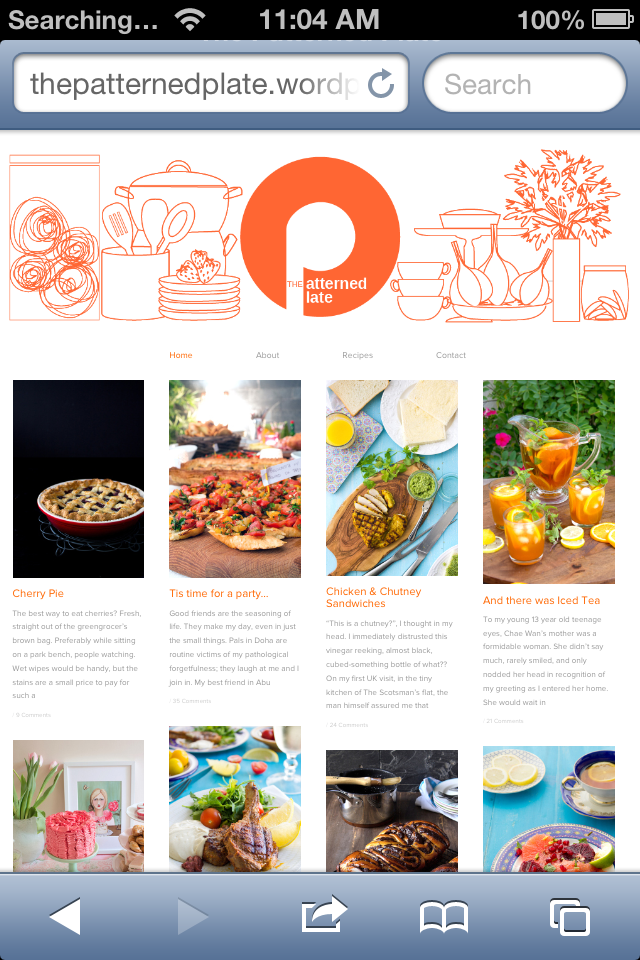
Carrie didn’t overlook a single detail on her blog. Using the Custom CSS editor that’s included with the Custom Design upgrade, she tweaked The Patterned Plate from top to bottom, designating everything from font sizes to hyperlink colors (her orange, again), to the spacing around post titles and comments. Every inch of Carrie’s blog looks exactly the way she wants it to.
She’s also used the CSS editor to apply her edits to the mobile version of her site (shown on the left), creating a consistent experience for readers no matter what device they’re using. (If you’d like to try your hand at CSS, head over to our CSS Forums, where community and staff experts can answer questions and troubleshoot.)
If there’s a particular theme you’d like us to highlight next, let us know in the comments!
Not using Imbalance 2? Check out the other posts in the Customizing series:
- Customizing Modularity Lite: Girls of Summer
- Customizing Koi: 129 Twig and Vine
- Customizing Comet: Beau and Arrow Events
- Customizing Sight: distraction no. 99
- Customizing Forever: Prada for Breakfast
- Customizing Bueno: Mi Piace Kate
- Customizing Oxygen: BeatRoute Magazine
- July 9, 2013
- Customization, HowTo, Themes

i use imbalance 2 too, and have found that making all the images square and hiding the entiries words behind a more tag make the blog feel more like a gallery than a blog. definately my favourite theme. i have tried other themes too, but i always end up switching back to imbalance 2.
LikeLike
Out of curiosity, how can you do custom social networking tools? Utilizing all the customizable options WordPress has to offer will probably mean learning how to do some basic web designing, but since I am inept at that (and this post came up to conveniently) I thought I would as for some help. Thanks!
LikeLiked by 1 person
You can do this with image widgets — upload the social networking image/icon of your choice to the Media Manager, then copy the URL, paste it into an image widget, and link it to the appropriate site. You can find more ideas and detailed instructions in this post: https://wordpress.com/dailypost/2013/01/31/widgets-101/
LikeLike
For a future feature, I’d love to see someone who created a uniquely shaped header and an explanation of the functionality that goes with that. The theme they use doesn’t matter to me.
RIght now I’m a very satisfied San Kloud user but when/if I get tired of the cloud header I’ll want something that similarly floats in midscreen and isn’t a standard box shape. Actually, I’d be curious to see any customization that successfully dispenses of rectangles in favor of some other geometrical forms.
Show us someone who takes the technology to its limit and is successful.
LikeLike
One thing that is really important to me, regardless of the theme I choose for my wordpress blog, is monetizing. How would someone monetize with a theme like imbalance 2? If you could write a post about monetizing this type of theme I would be very grateful, because that is the one thing that keeps me from using themes like this in any of my wordpress blogs on stand alone installations.
LikeLike
Thanks for the feedback! We can definitely highlight ways to monetize themes.
LikeLike
Oh, to clarify, I am not asking about how to monetize, rather how to integrate monetization into these types of themes using standard programs like Adsense or Commission Junction. Thanks 🙂
LikeLike
To clarify — If you’d like to monetize a WordPress.com blog, you can do it through WordAds (learn more at http://wordads.co). It’s the only ad program in use on WordPress.com at this point, and works with partners like Adsense to take the administrative burden off bloggers.
LikeLike
I use Imbalance, it’s perfect for me. Still, I just cannot figure out how I could have a whole length header image to that theme and to my blog. there are three widget areas and if I only use one it’s the third. Changing the photo won’t help. I have a custom design upgrade but there I can only chance color and font.
LikeLike