One Theme, Three Ways: Customizing Pilcrow
Some themes are so ubiquitous it’s easy to forget their eye-candy potential. Pilcrow, a popular workhorse of a theme, is a case in point. Used by almost half a million blogs, it’s near-impossible to miss its out-of-the-box look:

Dig deeper into the theme’s many customization options — both free features and paid upgrades — and you’ll discover a versatile layout and elegant simplicity. It’s the perfect backdrop to display your creativity and personality, even if — as the three bloggers we showcase today demonstrate — you choose not to use a custom background, aiming for a bright, streamlined look. Exhibits A, B, and C:


Great Smitten
Writer and photographer Faith, the blogger behind Great Smitten, managed quite the feat: creating a blog that’s at once colorful and inviting, yet spare and unfussy. Writing about food, family, and health, she went with a classic layout (out of the theme’s available six): a two-column spread, with content on the left side, and one sidebar to the right (to choose a layout, from the dashboard go to Appearance → Theme Options). This way, her posts — including some gorgeous photos — take center stage.

Simplicity doesn’t mean that Faith’s blog is any less hers. Her branding catches the visitor’s eye immediately with a playful Custom Header that mixes a handmade sketch with sleek typography (to change your header, go to Appearance → Header in your dashboard).

Custom Header
Her About page link? A clever use of an Image Widget (from the dashboard, go to Appearance → Widgets), featuring her own (smiling!) photo.

A customized link to the site’s About page
Navigation around the blog is streamlined, too. Forgoing Pilcrow‘s main menu, the only way to go on Great Smitten is down — endlessly (with Infinite Scroll). This way, we pay the most attention to the freshest content on the site, but can go on discovering older material if we wish.

Image Widgets for social links
Other visual elements that stand out as soon as you reach the homepage are the colorful ribbons that link to Faith’s various social platforms, and that allow you to email her or subscribe to her blog.
These, too, are custom Image Widgets, and they inject the mostly-spare site with just the right amount of vibrancy. Throw in some clean Custom Fonts (Museo Sans in the body of the posts), and you’re left with a highly readable, pleasantly engaging blog.
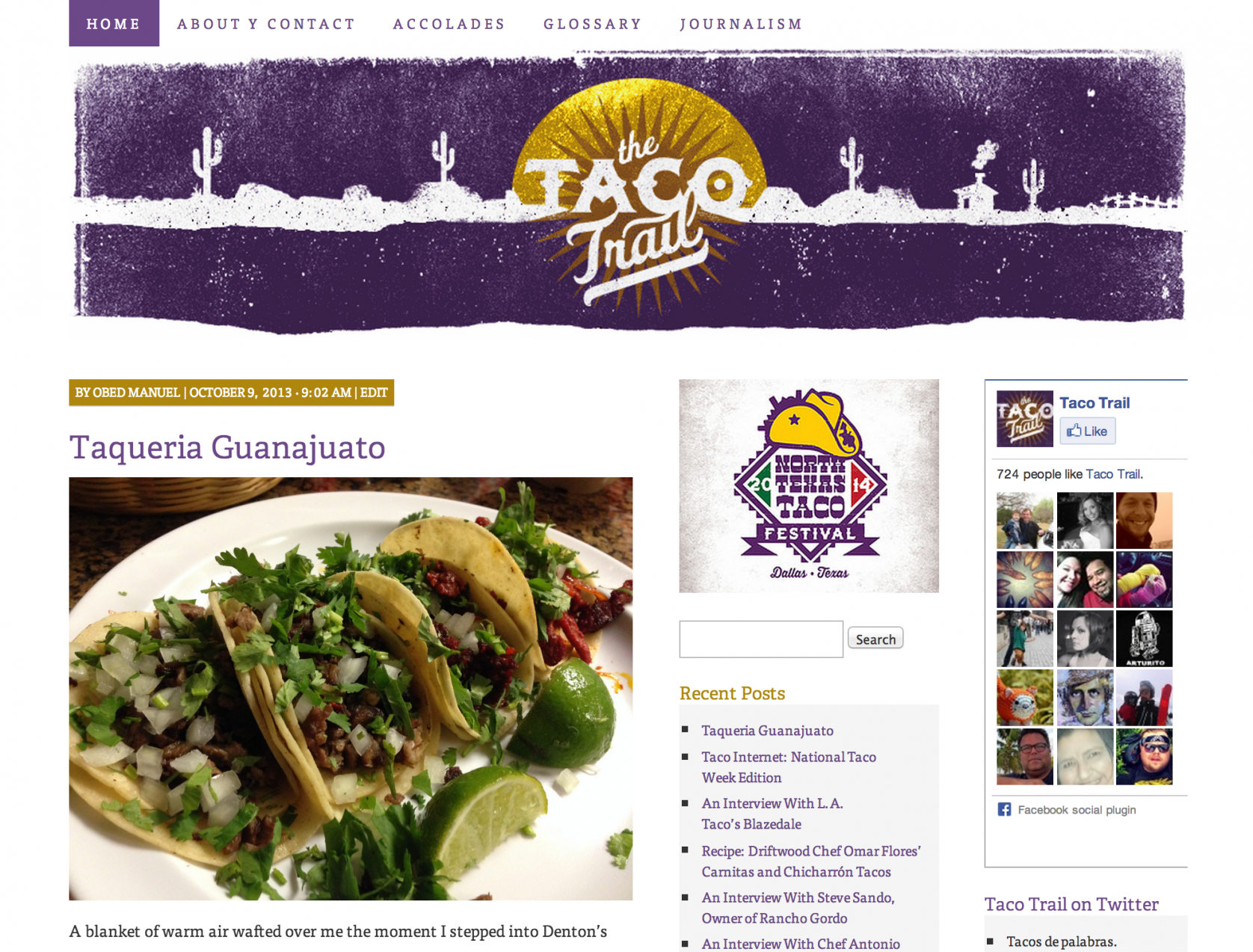
The Taco Trail
Even the most taco-averse (who are you, people?) will find The Taco Trail‘s design mouthwatering. Taconnoisseur José R. Ralat‘s blog documents his exploration of all things wrapped in a tortilla. While the food in question can get messy, his site never does.

Custom Header
A striking custom header sets the tone: it welcomes visitors with a colorful nod to Mexican graphic design, street art, and the desert landscape of Texas, where the blogger is based. The purple splash of the header is echoed in the main menu just above it, leading the reader to important information, from mentions of José in the press to an extensive taco glossary (which comes in handy if you’re not into lengua).
Beneath the header, the blog packs loads of content without overwhelming the eye. It uses one of Pilcrow‘s versatile layouts, featuring two right sidebars.

This way, there’s room for many widgets — the Recent Posts Widget and the Facebook Like Box stand out — without the need for excessive scrolling.

The site’s two right sidebars
At the same time, the abundance of information never tires the eye: text-heavy widgets are interspersed with beautiful images, and the same calm palette, achieved through Custom CSS, dominates throughout.
Candied Life
Lily O’Dare, the travel and lifestyle blogger behind Candied Life, chose a dramatic entrance to her site. Instead of leading her visitors straight to the latest posts on her blog, we are welcomed at a static front page that channels her blog’s tone: minimalist and sleek, but always fun.
A custom header features her blog’s name in cursive, stitch-like typography.

Custom Header
The rest of the page is composed of six whimsical sketches that direct readers to posts in their respective topics (from life in Miami to food). This way, your visit is guided not by publication date, but by area of interest. Pick the Eiffel Tower if you’d like to read about Paris, or a cupcake to hear more about Lily’s culinary adventures.

An image link from the static front page
For those who prefer a more traditional reading experience, a main menu makes it easy to switch to blog mode, with its normal, reverse-chronological order.

Here, too, the site maintains a playfully stark look: minimal widget use in the left sidebar makes it appear almost like a one-column, full-width blog. The photo- and YouTube video-heavy content always stays in the limelight.
A note on static home pages
If Candied Life piqued your curiosity about the possibilities of a static front page, check out some other great examples of Pilcrow using this feature (shared by many other themes):
- Photographer Mariko Evans‘ ethereal blog, Bohemian’s Eye
- Content consultant Katy McDevitt‘s website, Katy McDevitt Editorial Services
- The site of New Zealand-based, experimental music label Banished from the Universe
You might also enjoy these earlier posts in the Customizing series:
- What a Difference a Header Makes! Three Theme Customizations
- One Theme, Three Ways: Customizing Coraline
- One Theme, Three Ways: Customizing iTheme2
- Customizing Imbalance 2: The Patterned Plate
- Customizing Modularity Lite: Girls of Summer
- Customizing Koi: 129 Twig and Vine
- Customizing Comet: Beau and Arrow Events
- Customizing Sight: distraction no. 99
- Customizing Forever: Prada for Breakfast
- Customizing Bueno: Mi Piace Kate
- Customizing Oxygen: BeatRoute Magazine
- October 22, 2013
- Customization, HowTo, Themes

Love the clean, streamlined look and custom header. I look for alternatives all the time, but Pilcrow fits my blog best.
LikeLike
These blogs are awesome. Great design and use of the pilcrow theme.
LikeLike
The theme looks great and have many different features. I have browsed this theme before but after reading today’s article, I got to know more about its features and details. I’ve changed one of my blogs to this theme. 🙂
LikeLike
I’m new to blogging. I have a long way to go before mine looks this eye-catching! Exciting though, to see what can be done.
LikeLike
Many of these tweaks are very straightforward and can be done relatively quickly. If you’re looking for hands-on customizing advice for new bloggers, check out this tutorial.
LikeLike
Does this theme allow for a dropdown on the Archive list to show the blog titles per month?
LikeLike
Absolutely — you just need to activate the Archives Widget in your sidebar, and check the boxes that say “Display as dropdown” and “Show post counts.”
LikeLike
I really like the customized elements on Great Smitten. I’m still trying to nail down my template and it’s so helpful to see all of the possibilities that come from one theme.
LikeLike
Wow! these are great. I’ve been experimenting will all sorts of themes on my three blogs to see which ones fit best. Sometimes they have little hidden gems that you just never see while browsing. You have to actually activate a theme and play around with it. Thanks for telling us about this one.
LikeLike
I love the hand-made look and wonder if this can be overdone. Maybe not, eh? Thanks for highlighting these and helping us imagine more and better for the future.
LikeLike
i like this theme and i had used it for one of my earlier blogs—that blog is pretty much retired at this point but seeing it again make me think twice. I may revise the old work-horse
LikeLike
I always enjoy seeing the incredible contrasting results of the same theme among different bloggers.
LikeLike
Great ideas for Pilcrow theme! I’m also using it for my blog. I like how versatile the theme is. And there are 2 colour schemes. What’s more the theme is easy for customise. Design your own header and background to make your blog stands out.
LikeLike
A theme close to my heart! The older version of Pilcrow was the first WordPress theme I used. I think it was called Press Box at the time. I’ve experimented with a number of themes, but still like Pilcrow best. Plus, I understand it’s one of the themes that’s maximized for WordAds! I’m planning to launch a new blog using Pilcrow soon. I’ve used a number of my own photos in the header, but still haven’t gotten around to getting a true custom header, with image and title all in one. I’ll have to hire an artist to do that.
LikeLike
One of the most customizable WordPress themes. Next time I have some down time, I might switch to this!
LikeLike
How can I remove the navigation at the top of the page like Great Smitten did?
LikeLike
That was done by creating a blank custom menu and assigning it to the Primary Menu area under Appearance > Menus.
LikeLike