Theme Thursday: The Journalist
November 22, 2007
Ok, ok, we hear you: enough of the dark themes already. Here’s one that should help set the universe back into balance: The Journalist by Lucian Marin. It’s a crisp, professional, black-on-white theme designed for serious writers.
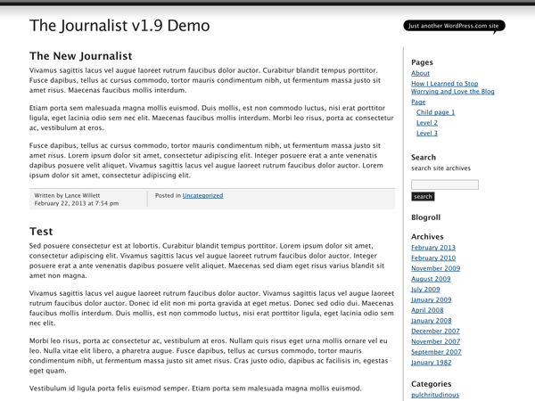
The Journalist features a fixed-width, two-column layout, elegant typography for post text and block quotes, and supports widgets in the right-hand sidebar. Look for it on page 4 of your Presentation / Themes tab (under “T” for “The”).
Join 110.8M other subscribers
- November 22, 2007
- Themes

Nice. Crisp. Neat. Wider space for photos. It’s funny how the widgets have “The.” Unfortunately, I find it too plain. Not for me.
LikeLike
YES! Finally a theme I can identify with.
Thanks
LikeLike
Been waiting for this, any chance of doing it w/a header option, and moving the extremely obtrusive tag box to the bottom? Other than that, yahoots all around.
LikeLike
flawedplan: we just make the themes available as they’re designed – without a header image in this case. I’m not sure what you mean by the tag box – the dark grey meta box? Only categories are included there, tags are listed underneath each post.
LikeLike
Lovely! 🙂 I’ll use it soon.
LikeLike
But what if Im not a serious writer? Then what… ?
LikeLike
I agree with Frances – it’s crisp and clean, but too plain for me. I would like to see a few more creative themes come out! 🙂
LikeLike
Anna: if you have a suggestion for an existing GPL’d WordPress theme that you’d like to see on WordPress.com, please post about it on the forum.
LikeLike
Nice! Simple and Professional. I’m using… 🙂
LikeLike
Nice work alex, I love the theme a lot.. Thats almost the minimal I wanted for my blog.
Thanks.. Keep up the good work
LikeLike
Brilliant theme, tried it out and I love it.
Switched to it, now if just someone can tell me how to make the text of all my posts justified?
LikeLike
Love it! I can even do without the header. But I can’t do without the tagline. Any chance on getting that coded in?
LikeLike
vjp: again, this is the theme as it was designed. There’s no obvious place in the design to put a tagline. I’d suggest adding a text widget to the top of the sidebar instead.
LikeLike
good one .. i love the white space !!!
LikeLike
W0owww…Cool….
it look simple, nice work!
LikeLike
Less is more. I love this one. Thanks.
LikeLike
Alex – that’s exactly what I ended up doing 😉 By the way – there is an extra word in the date format line. It shows “on the November 21st, 2007” – the word “the” shouldn’t be there.
LikeLike
Me too! I *am* a serious–although sometimes flippant–writer, and I like the minimalist but professional look of this. I’m off to play with my widgets. Thanks Alex & Lucien
LikeLike
That’s hot.
LikeLike
Yes, yes, yes! Almost perfect! I`m using it right away.
LikeLike
This is neat. Journal/Magazine-looking theme is the “in” these days. Minimalist and easy on the eye.
The previous and this current are two the best so far.
LikeLike
Not for me, who’s a dark themer.
Anyway, ty WP n’ happy thanksgivin’!
LikeLike
Great, one can’t get enough of minimalist themes. More room for one’s own content!! It would be nice to have more customization options and double sidebars though. Still, it’s really great how you guys keep turning out something new!
LikeLike
i prefer the darks like mine !
but this one looks awesome !
LikeLike
Nice one.. I’ll try it out.
LikeLike
Preety Nice i can say 😀 Very clean and simple! Give us more cool themes!
LikeLike
Hmm, when I open a post, sidebar moves down under the post and coments. Is it supposed to be so?
LikeLike
msmarii: please use the contact form or forums to ask for help or report problems.
LikeLike
nice theme on that day specially 😛
thanks wordpress team.
LikeLike
Looks nice.
LikeLike
That is very smart and crisp. I use too many images for it to work well for me – but if I give up the images and just write that would be the one for me.
LikeLike
I like this theme. It’s a great one for blogs that have primarily news and op-ed pieces as content. It’s not for light reading like mine, but if I should want to explore my academic, serious side, I might use it.
LikeLike
I love this theme. I may change over. Can you add a custim header with the CSS upgrade?
LikeLike
http://flightpath.wordpress.com/
Alex Shiels…I like your present blog with all the nice big images!
something I would like to do and have some links on the side …very good idea…
Susan in italy
LikeLike
Cat-atsic theme. You guys are just awesome.
LikeLike
this is EXACTLY what i was looking for in fonts and layout. Thank you wordpress design team!!!
LikeLike
have been really diggin re-doable lite and i’ll miss the customizable header but this is really niiiiiiice. Works great for readers. i like black backgrounds but they’re not the best for everybody and this really leaves it all up to the content. thanx az always, you guys (f/m) rock!
LikeLike
The new theme has a simple elegance which is very nice. I tip my hat to the development. However, I can not resist to say it seems great effort is always offering ‘journalistic’ formats. From viewing the available themes, the majority principally have white backgrounds, possessing a splash of colour, with a few options with presentation. Yet, there remains a void with dark colored themes (black background), offering three-columns; either two sidebars on the right or one on either side of the text column.
Someone once commented within this forum that black themes are more of a ‘passing fancy’ or some other ill conceived comment. This is not true. There are those in the midst of WP users, who prefer a dark theme (all black), just as a matter of preference!
The theme I currently use ‘ChaoticSoul’ is a great theme for which I’m grateful; it would be better if it had another sidebar.
If there were something which had the ‘glass appearance’ of “Black Letterhead”, with three columns, with a customizable header image, I would dance a jig and drink a tankard of ale. It was suggested to me to offer some recommendations regarding GPL’d Themes, but when I replied with another question on this recommendation it fell on deaf ears.
I guess we will continue the wait. Waiting… Waiting… Waiting…
Regards!
LikeLike
well, that so simple.. so plain.. but i think that’s good
LikeLike
I like it alot. Just need a good reason to use it on myself.
Thanks WP!
LikeLike
I LOVE IT… BUT… I NEED A SIDEBAR FOR MY PAGES 😦
LikeLike
Sandra: the theme has a sidebar. If something isn’t working properly, please contact support.
LikeLike
Simply, clean and good looking.
LikeLike
Nice…clean-looking Professional theme this.
And ’twas about time the Light-Theme-Lovers stole a march over the Dark-themers 😛
LikeLike
What’s black and white and red all over?? The “Journalist.”
Sorry – that was a really bad joke, but I there’s no bourbon for my coffee.
LikeLike
Lovely, I think I’ll give it a go soon.
LikeLike
It’s up on wptheme if anyone wants to check it out quickly:
http://wptheme.wordpress.com/
LikeLike
thank you 🙂
very nice designing.
I am switching to Journalist theme 😀
LikeLike
Love this kinda theme la… but…
Can you get something more STYLISH with colors etc?
Love this style for photo blogging though.
LikeLike
Saya langsung gunakan theme ini begitu saya melihat berita ini di dashboard.
Terima kasih untuk Kang Matt dan konco-konco, semoga semakin hari WP semakin maju dengan gebrakan-gebrakannya.
Salam dari Jogja.
LikeLike
só tava faltando ”Imagem de Cabeçalho”
LikeLike
Love this theme 🙂
LikeLike
Looks OK but would have benefited from a customisable header. The theme is meant to appeal to would be journalists (maybe) and a more flexible header facility is missing at present from every theme I’ve tried -but highly desireable. ‘Do not underestimate the power of the front page Luke’.
I’ll test run it on my handheld as some themes don’t display well on windows mobile otherwise I will stick with Kubrick a theme I know works well and is reasonably customiseable.
LikeLike
i like it. i was using chaos theory but now im in like with this one.
LikeLike
actually i tried it and i dont like it. im back to chaos theory.
LikeLike
I just noticed something – the left line shown in the photo is not showing up in the theme. An oversight, maybe?
LikeLike
nice clean, crisp….but no excitement….dull.
je3
LikeLike
Why are writer’s always assumed to be “dark and mysterious and dreary?” I’ve been a writer for many many years and am not dark. I do write about emotions, some of which are not always happy, but I also write about the beauty of my life, the laughter and the upside of things. I write for kids, about grace and laughter. I guess what I’m sayin is not all of us are dark, moody and depressing. We aren’t all trying to “find ourselves.” I’ve found myself, it’s just that sometimes I would love to give some of myself back to wherever it came from….maybe the mother ship….just kiddin!!!!!!
LikeLike
I would use it if it had a banner. Looks good.
LikeLike
I love this theme. Thanks, WP.
LikeLike
I’ll use it now.
LikeLike
I am so ready for it…you know!!!
LikeLike
It is pretty close to what I was looking for. A customizable header would have been nice, of course. And maybe a slightly larger font. I do like the looks of the dark bars across the page.
LikeLike
nice theme. can’t wait for your next one.
LikeLike
So, engtech, this is your creation? Why am I not surprised? Great work as always.
LikeLike
Wait – it says Lucian Marin designed the theme, so I am assuming engtech organized the sample site for us to view? Correct?
LikeLike
It’s very clean, but not for me, I’m too big a fan of color. This would be great for a photoblog though, or very serious blog, but if there’s not a lot of pictures going on I think it would be overwhelming. The site of massive blocks of text, methinks, would turn off a lot of readers. Regardless, it’s a nice addition, I’m all for new themes being added!
LikeLike
Good, moving frm DIGG to this one..
keeps it simple..
LikeLike
VERY PROFESSIONAL!!!
LikeLike
All and all I like this theme. It has a large blogging space that should please photobloggers. There’s more feedback here
LikeLike
I Am a Journalist This Is Very Fun , Thank You Very Much! I Kiss You
LikeLike
Ha ha. Nice theme, but I try to not take myself too seriously as a journalist, so I’ll pass on this one for now…
LikeLike
I wish I can change the Header.
LikeLike
I actually do not have an issue with the um, whats it called “theme” that I am using . I will check that one out later this month, God Willing. Very nice though, very sophisticated and classy. Nice
LikeLike
the theme’s nice….good work =)
LikeLike
Hmm… clean and simple.
I like it. 🙂
LikeLike
Reminds newspaper style
LikeLike
I always like the theme with minimalist, white and systematic pages. It’s good for reader and myself. Thanks for WordPress from Indonesian blogger using WP.
It’s amazing in my point of view that some Indonesian blogger give quick response (change their theme and write comments here) to this newest theme. I think this kind of theme is suitable with low-speed bandtwith.
Cool! I will use it for couple of day and back to White as Milk.
LikeLike
Transparent and pleasing to the eye. Applause.
LikeLike
Three columns would make it better!
LikeLike
It’s an elegant theme. I would have used it but it can’t seem to accommodate pages which is a pity
LikeLike
Eliza D: all of our themes work with pages, The Journalist included. Don’t forget to include a Pages widget in your sidebar if you haven’t already.
LikeLike
Thanks a lot Mr. Alex
nice theme…perfect for serious writer 🙂
LikeLike
This is a very nice app for photobloggers, like me! Thanks for the space and simplicity!
LikeLike
Nice theme better than some of the others.
LikeLike
Looks impressive, clean and simple, but black on white just isn’t for me. Make your next featured theme a colorful one!
LikeLike
Manna from the heavens! This theme is perfectly suited for me. I will in fact use it the rest of my life.
LikeLike
That’s not a theme (design)!
It is text on white background.
LikeLike
welldone thats great theme
LikeLike