Five Elements For Your Front Page
Your site’s front page is like the front door to your home: you want it to look and feel inviting, as well as unmistakably you. Here’s a quick list of five things — big and small — to consider when building your front page.
Whether you’re building a website or online portfolio, or a blog with your latest posts displayed front and center, you want your site’s front page to look great, but also provide information your readers want and need. Here are five elements, from beginner’s tweaks to bigger ideas, to consider as you create your online home:
1. Your blog name, loud and clear
You want your visitors to know exactly what your site is about the moment they land on your homepage. One of your first tasks when creating your blog is to set your site title and tagline. Note that site titles display differently across our 250+ themes.
We love the way recently launched Hemingway Rewritten displays a blog name and tagline in a sleek parallax-scrolling header:

The header of A Patchwork Life, using the Hemingway Rewritten theme.
You can also create a custom header image, which you can upload in Appearance → Header, as Bethany Meyer displays boldly at Life Absorbed:

2. A hook that’s uniquely you
Our blogs, websites, and portfolios are akin to digital homesteads. And like physical houses, we make our sites just so: our backgrounds are like painted walls, our sidebars like bookcases. How can you draw in a new visitor at your doorstep?
Think of a journalist’s story lede. Or a cinematographer’s first frame. What’s your hook? Sure, you’ve got an About page or a blurb in your sidebar. How else can you attract a new reader?
Author Richard Wiseman fills his homepage with his “30 Second Introduction”: a slideshow summarizing his work and accomplishments in succinct, easy-to-read slides. Adding movement to the page, the slideshow is a simple, visual way to tell his story:

The website of Richard Wiseman, on a transformed Funki theme.
From an illustrated bio to a web comic about your life to a video introduction, how else can you tell the web what you’re all about?
3. A concise and visible menu
So, a new reader lands on your homepage, but can’t figure out where anything is. You might have the most awesome header image, or About page, or professionally made logo, but none of that matters if a visitor can’t navigate their way around your site.
Artist Pam Carriker uses a simple, straightforward static front page, transforming the Elemin theme into a one-stop destination for her blog, products, press, tutorials, and projects. We appreciate the clear, concise tabs in her primary menu:

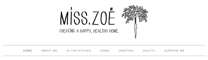
Remember, though, that your menu doesn’t have to reflect your site’s page structure — you can create a custom menu that mixes some of your pages and categories, plus external links. We encourage you to think beyond the usual tabs (Bio, Blog, Contact): Get creative. Use your voice. Link to the passions and interests that shape you, like in this header by Miss Zoe:
4. A cohesive look and unified design
You don’t need to be a pro to create a site with unifying design elements. But you need to think critically about its look and feel — to stand back to see if the pieces make sense and come together to make a whole.
Consider the header image at the collaborative blog, LeaderGeeks:

Poke around their site and you’ll see the graphic faces in their header in their author gravatars, and splashed across their Facebook page as well.
The elements that tie your site together don’t need to be expert-made illustrations or logos — a unifying detail could be a simple yet bold font used in your header and sidebar, or one accent color. We like how Design By Lulu uses strategic splashes of powder sea blue in her header, widgets, and occasional graphics in her posts:

If you’re feeling artsy, make custom image widgets down your sidebar to build a cohesive design, using free online editors like PicMonkey. For inspiration, visit Debbie Does Doodles, the whimsical space of Edinburgh-based blogger Debbie. Her category widgets create a pleasing, consistent pattern.
5. Ways for readers to connect with you
Finally, give your visitors various options to connect with you. You can include your email address in an About Me blurb in your sidebar. Publish a “Get in Touch” page with a contact form. Add the About.me widget to your site, which displays information from your About.me profile. Create a menu specifically for your social accounts, if your theme supports multiple menus:

A top primary menu of social links on Twenty Fourteen
Or, as many bloggers do, create and upload social media buttons so readers can follow you across the web. We love how many of you use these buttons to further unify your site’s design — and it often doesn’t take much more than adding pops of a complementary color, as seen on Scrawny Girl:

If you’re building your website’s homepage, or simply looking for ways to spruce up your blog’s front page, we hope these tips get you started.
- April 8, 2014
- Design, WordPress.com

Thanks for the tips. How do I add the “Share this” bar to the bottom of my posts?
LikeLike
Hi Michael — to add sharing buttons, visit Settings → Sharing in your dashboard. (Steps are here: https://wordpress.com/support/sharing/) You can customize your settings to choose the icons you’d like to show, as well as what pages you’d like them to appear (posts, pages, front page, etc.).
Does this answer your question?
LikeLike
Thank you, Cheri. That’s exactly what I needed.
LikeLike
This is a fantastic post Cheri! I have probably changed my theme half a dozen times in the past two years… trying to find a look and feel that was an extension of me. With the Suits theme, I’ve finally done that.
I love the simple, clean and organized layout for my street photography posts, and the single sidebar is the perfect amount of space to house my social media buttons and top posts.
I’ve always tried to look at themes that allow custom headers, are responsive, and have a pleasing photo layout, and then I work from that.
Thanks again!
LikeLike
I love the Suits theme as well — I’d used it for a while for one of my blogs. Definitely clean and simple, yet elegant.
LikeLike
Great post! Will definitely keep your suggestions in mind as I try to improve my new blog. It’s been only 2 weeks since I’ve started my blog but I am learning so much thus far.
LikeLike
Nice outline of the necessities with some cool points/suggestions.
~Jones
LikeLike
Thanks for the tips! As a newbie to the blogging world these are very helpful!
LikeLike
Fortunately I’ve all these on my front page 🙂
LikeLike
thanks for your tricks, i will get new header for pertamax7, still waiting on idea 😀
LikeLike
Our website is not ‘blog-centric’, so I’m interested in how to draw attention to the blog posts but not at the expense of missing the rest of our information/links.
LikeLike
Hi Peter — you can build a website of mainly static pages of essential information, accessible in your custom menu, and then within your menu include a News or Blog tab that leads to your latest posts. So, readers can access a “feed” of news/updates, while still being able to navigate your static pages of information.
More info/examples:
https://wordpress.com/support/pages/front-page/
https://wordpress.com/blog/2014/02/12/static-homepage/
In other words, you don’t have to choose one or the other (blog vs. website) — you can maintain a website, with a blog section.
LikeLike
Thanks, Cheri. How to have the categories appear as menu bar?
LikeLike
Hi Yoshiko — you can add categories to a custom menu, which we explain here: https://wordpress.com/dailypost/2013/04/17/working-with-custom-menus/
In your dashboard under the Appearance > Menus panel, you can select your tabs among your pages, categories, as well as custom links (ie, links to exterior webpages and websites).
LikeLike
Cheri, thank you 🙂
LikeLike
Fengshui for bloggers now! I love it Cheri! Thanks for sharing!
LikeLike
Thanks so much for the tips! As a new blogger, I am always seeking out way to enrich my blog.
LikeLike
Hi, Cheri. Thanks for the tips. My initial intent was to build a website for my business. But this “Blogging Thing” becomes more interesting each post I get WebPost.com News. Now I am not sure which to pursue. Seems like I need to do both….LOL. Thanks again for the insight(s).
LikeLike
You can build a website to promote your business/brand, but also blog and publish content regularly/daily, too — to do so, you’d add a “blog” or “news” tab, accessible in your main menu, so readers can access an ever-changing stream of posts while still being able to navigate your static pages of information.
More info/examples: https://wordpress.com/blog/2014/02/12/static-homepage/
In other words, you don’t have to choose one or the other (blog vs. website) — you can maintain a website, with a blog section.
LikeLike
Great tips, although when it comes to front pages there are no standards, and from my opinion front pages should be dynamic, some don’t require a name, some require only images. There are no rules for front pages, except from only one, every front page should be unique to the websites content. Well this is my personal opinion, so feel free to disagree :).
LikeLike
Neat article and I like the examples (images) you used. I’m not new to blogging, but I am new to WordPress (since the end of March) and to blog in my second language English. A helpful article is always welcome. Thanks!
LikeLike
That slideshow idea is brilliant! I’ll definitely consider that for my own site.
LikeLike
I love reading these tips, not only does it inspire me to become a better blogger and make continual improvements to my blog, but I learn something new every day! Thanks.
LikeLike
This post is great for such a time as this; I only recently started blogging, so this is very helpful. Thnx
LikeLike
Awesome information! I see that I need to make some changes/updates to my blog…Thanks for the tips
LikeLike
Very nice examples of front pages! Coincidentally, I was also working in my front page for the last weeks, I believe I still have much to do to improve it, but I’m always trying to create new ways of showing my portfolio to others. I also learned recently that we can make fantastic changes to our blog with the custom design upgrade, so I’m totally satisfied with ‘Wordpress.com’ 🙂
In the past, I had a Joomla self-hosted website. When I migrated to WordPress.com, I did see many barriers to my freedom of showcasing my art.. in fact I almost gave up many times.. fortunately I never gave up and now I can say I’m really proud to choose and trust in ‘WP.com’ 😉
I tried tons of themes and was never satisfied with any of them, until recently I discovered a clean theme (Sundance) which can be easily adjusted to my ideal layout.
No matter the challenge, we can make a really nice front page if we work hard enough for it, and I will try to always keep improving my skills for that purpose. I wish good luck for everyone trying to improve their front page, as I’m trying to do with mine as well. Thanks very much for this article and the examples! ❤
LikeLike
Good stuff. I’ve been meaning to figure out how to do personalized social media buttons for awhile and this has given me the motivation. Thanks!
LikeLike
Boy, do I wish you could just recreate my blog’s front page. Even thought I am a quite visual and organized person I get overwhelmed by all this info. It shows I am not much of a techie, I suppose…so will have to just spend an afternoon fooling around until I get it looking great! Thanks for the help, though, as always. (Where is your tiny houses blog? I think I lost it.)
LikeLike
Hey Cynthia — it takes time to get the site and look that you want. You can spend all day customizing and tweaking and previewing new themes — I’ve done this for all of my blogs, and even when satisfied I continue to experiment. (Also, here’s the tiny house blog :))
LikeLike
Cheri, thanks for the encouragement; I will just have to bite the bullet and make myself do it! I continue to get many followers daily–likely due to being Fresh Pressed. That’s when it started to gain.Thanks! (And lo and behold, I am still connected to your fascinating Tiny Houses blog. I guess you just haven’t written a post lately. But it’s all good–I can wait for more fun!)
LikeLike
Great info! This is helpful as I’m trying to build my page.
LikeLike
Great post Cheri, your tips are clear, simple and helpful.
LikeLike
Definitely some helpful tips given by you Cheri. The most important one of them being, the blog must look complete as a whole. While contrast may be good at times, but the pieces should look like one belonging to the same puzzle. Nice read…thanks for sharing!
LikeLike
Nice post, though I dare to remark that you use examples of blogs that are not very ‘active’, all the while (in many other posts) stressing the fact that the most important thing for successful blogging is … well … frequent blogging.
Your front page might look as sweet as candy. If there’s no content, no one cares.
LikeLike
Thanks for the input — yes, the last few examples hadn’t posted since 2013, although included more for their design elements.
(While I think frequent blogging is a sign of success to some, and in some cases is a habit we encourage, I don’t think it’s a requirement to be a successful online publisher.)
LikeLike
How do I add the Copyscape banner on my front page? Thanks!
LikeLike
Hi Arlene — are you referring to these? http://www.copyscape.com/banners.php I believe you can add the code provided within a Text Widget and add it to your sidebar or footer.
That said, if you want to build a site with cohesive, clean, and eye-pleasing elements, I’d recommend simply creating your own Text Widget with the disclaimer text you’d like to include — I’d be careful in choosing these extra widgets and design additions that might actually detract from your overall design, rather than enhance. Of course, there’s no right or wrong way to add widgets and design tweaks — you can add elements that make sense for you.
LikeLike
Thank you so much Cheri, I appreciate your reply 🙂
LikeLike
Very timely thanks! This gives me something to work on. I’m just starting out and the behind the scenes technical stuff can be difficult for me. I’m learning lots though!
LikeLike
I just started out and so far I think clean and simple is the best way to go. Is the background image and header under the customize package that you have to pay the $99 for?
LikeLike
No — you can add a custom background or header image for free without an upgrade, provided that your current theme supports both.
Here are themes that support custom backgrounds: http://theme.wordpress.com/themes/features/custom-background/
And those that support custom header images: http://theme.wordpress.com/themes/features/custom-header/
You’ll see that the majority of our themes support these two features. We’ve written about these free customizations before — for your reference:
https://wordpress.com/dailypost/2014/02/18/free-custom-header/
https://wordpress.com/dailypost/2014/03/19/quick-tip-backgrounds/
https://wordpress.com/dailypost/2013/04/13/branding-your-blog-lets-get-visual-101/
LikeLike
Thank you!
LikeLike
The basic info is here: https://wordpress.com/dailypost/2014/04/04/april-challenge-signups/. You’ll be getting an email this week with more details and instructions, and the course begins next week on Tuesday, 4/15.
LikeLike
Wow this was so incredibly helpful!! I am about to start a freelancing photography business and I am trying to figure out how to present myself correctly.
LikeLike
Hi, how do you add the contact form to your website? I am having problems getting it to show up properly.
LikeLike
Hi there — we’ve written about adding a contact form to your site before:
https://wordpress.com/dailypost/2013/05/09/engaging-forms/
For reference, the main support page with steps is here:
https://wordpress.com/support/contact-form/
LikeLike
I like changing my header image, from photographs I took myself. I change with the seasons. Cheri, is there a way we can get a “critique” of our layout? Suggestions for improvement?
Thanks!
LikeLike
On Sundays at The Daily Post, there is a Community Pool where bloggers can share links to works-in-progress, questions about their site and design, and more: https://wordpress.com/dailypost/category/community-pool/
You can pop into one of those previous discussions, although probably best to wait until this coming Sunday to add a question to the post for feedback from others.
And of course, you can always ask questions in the forums: forums.wordpress.com
LikeLike
When I visit a blog, I would like to see a list of recently commented posts , with the date&time of the last comment on each post and the comment count (= Recently Commented Posts Widget). This would save me time – then I don’t need to open each post just to check whether it has been discussed or not after my last visit. The comment account would help me to estimate how much time I need to read the comments.
The Recent Comments Widget doesn’t give enough information. If visitors write a lot of comments on one post, the comments on other posts will quickly disappear from the Widget.
LikeLiked by 1 person
Very informative and cool 🙂
LikeLike
Hi Cheri – Thx for your tips. I am still thinking about some topics you’ve said – so let’s see how I will use it on my new blog.
LikeLike
Hi Cheri, Thank you for these tips. Though I’ve being blogging for a while, I decided to step it up just today and I happened on your blog! And I have just started building and managing other people’s blogs, so this helps BIG TIME! Thank you!
LikeLike
Thank you for the tips. it will help me in the future as my blog grows.
LikeLike
Great tips, thank you, Cheri! I even like the way you designed your post — using all of your own tips to make it swing. 🙂
LikeLike
This current site of mine (The Book Wrangler) is brand new so this post is bookmarked – design is key for me and I refuse to post at all until I am 110% happy with it
LikeLike